
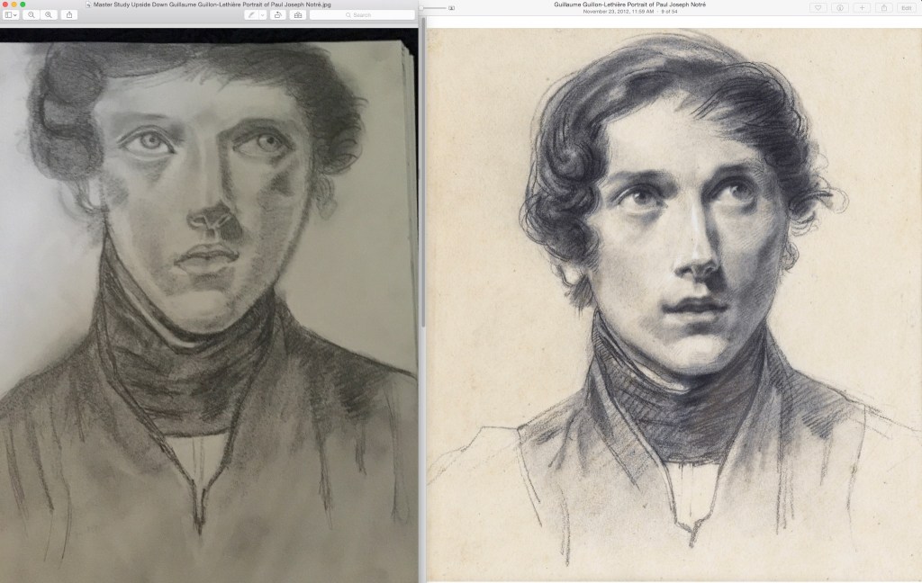
I wanted to share an assignment from one of my classes this semester. I may share a few more, but this is one that I had started practicing with years ago and after all these years got to put the study to use. My teacher said it was “very successful.” I was just so pleasantly surprised to hear that even though he no longer looks like the original guy in the portrait. =)
The original study was an Upside Down Master Study of Guillaume Guillon-Lethiere. The purpose of drawing it upside down is to focus on the shapes of the shades, and not the face your mind tells you to see. The shapes are the shadows that are actually there not what your mind expects to be there. This exercise helps to train your eye to see what is truly there. I did this for my own practice. It was not for any class.

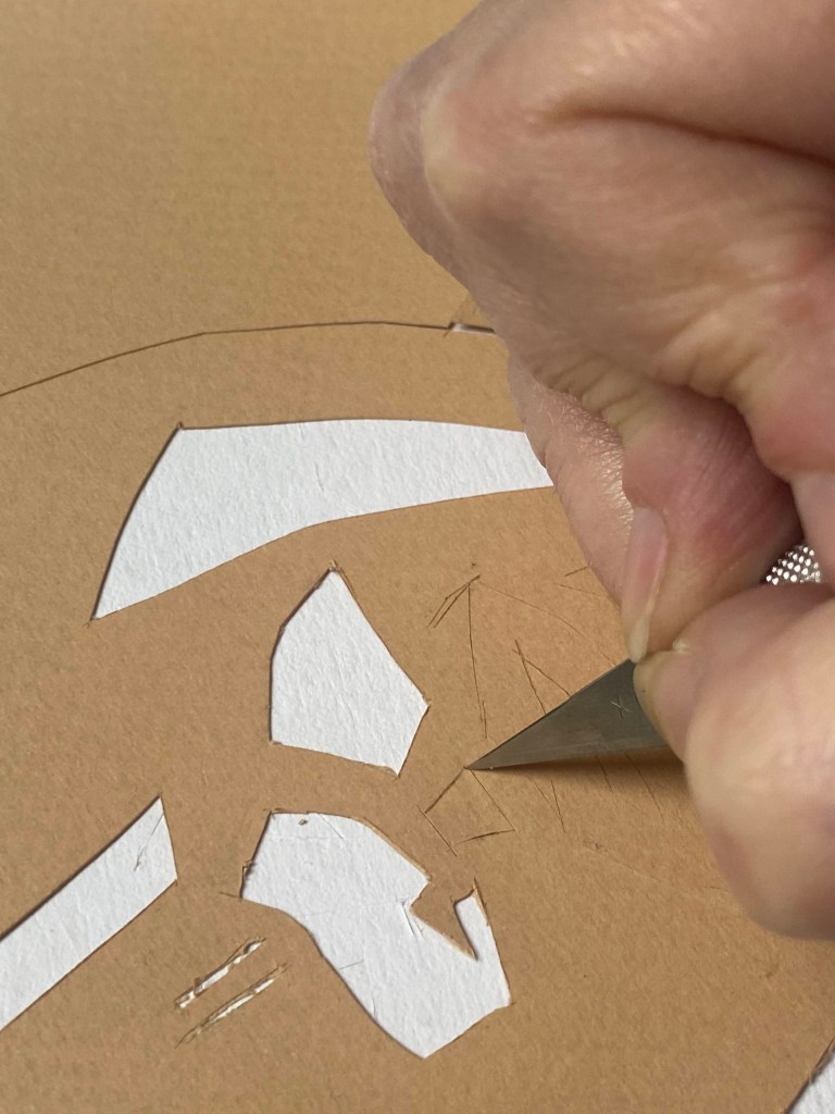
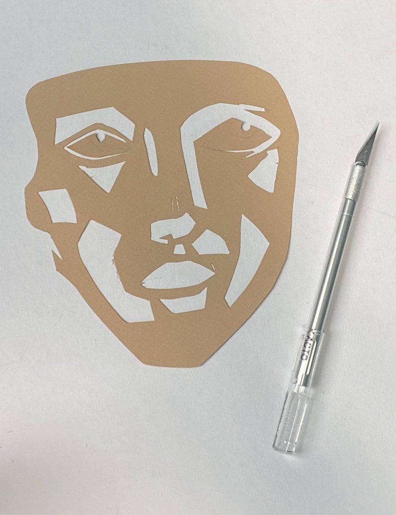
This semester we were studying the push and pull between figure and ground. Again, it is about the shapes of the forms interacting be they negative space or a form. I was inspired by an example of a previous student’s work which I cannot display, but it blew my mind. It was made in the same manner as my figure ground poster – cut outs of one color paper on another color. I wanted to try it for myself. I can tell you that it is very difficult for hands prone to arthritis. It also requires a consistent pressure and attention to detail I do not possess. I really wish you could see the piece that inspired mine but suffice to say mine pales in comparison. Still, I enjoyed the process (when it didn’t hurt), and was surprised by how mine did turn out. Mind you this is my first time ever doing cut and paste art.

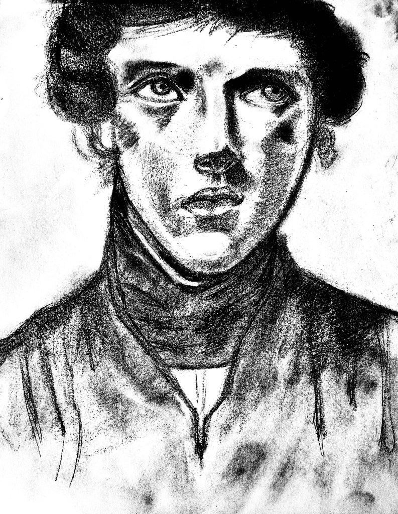
First I digitally enhanced the image of my upside down study to give it a higher contrast making the black and white areas more prominent. Then I traced the image. Next, I taped the traced image over the tan construction paper and cut. After I had it all cut up I placed it back together on the blue construction paper. We are learning in my Color Theory course about how the placement of surrounding colors impacts colors. As you can see, the face is less than impressive against a white background of the paper board I was cutting on top of. But with the complimentary blue paper, the face really pops.


Thanks for looking at my art. Feel free to (gently) critique it in the comments below.


Good Morning dear friend Lynda,
This is another good article on Art. Thank you.
This is a creative idea and an inspiration to the one who wants to become an artist.
Regards and blessings,
Uma
LikeLiked by 1 person
Thank you, Uma! Thank you so much. You are so kind to me.
LikeLiked by 1 person